CHOROPLETH MAP

A choropleth map uses a color scale to provide the onlooker
an easy way to see how the variable being measured (in this case harvested
acres of hay) varies within a particular region. This map utilizes a green
color scale as its legend that shows all the counties’ hay production. Usually,
the darker the color the higher the value, the lighter the color the lower the
value. This map also has a detailed title.
DOT DENSITY MAP

This is a dot density map. A dot density map uses dots to
illustrate the density of the variable being measured (in this case tobacco
farms). This is a one-to-many dot density graph meaning that for every one dot
there are fifteen tobacco farms. This map also makes good use of the North
compass reading; clearly letting the onlooker know which direction they are
looking.
PROPORTIAL SYMBOL MAP

Proportional Symbol Map uses the size of the symbol to
represent the value. The bigger the symbol is the higher the value is going to
be. To read these maps one looks at the size of the symbol in the map then
compares it to the size of the symbol in the legend to figure out the quantity
of measurement. This map measures the amount of forestry in each region of
Europe. This map is easily and quickly read, and has all the requirements of a
good map.
ISOPLETH MAP
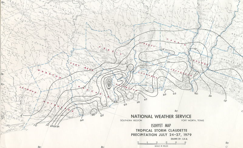
Isopeth maps use contour lines depict a value because the
value cannot be measured accurately at a certain point. They usually measure
the elevation changes of land but these maps can also be used in meteorology to
measure such tings like air pressure, rainfall, and temperature.
BATHYMETRIC MAP

Bathymetric maps measure the depth and change in elevation
of bodies of water. It is a Topographic map but for water masses. Divers use
these maps to anticipate changes in pressures due to changes in water depth. In
the Bathymetric map above, it is easy for an onlooker to differentiate
different depths because of the maps color scheme. Green would mean higher
elevation and purple the lower elevation. This map is NOT complete with a
legend, title, or north facing compass reading.
ENVIRONMENTAL SENSITIVITY INDEX MAP

Environmental sensitivity index maps map the environmental
cultures of shorelines. They usually map more than just one element. They map
things like animal’s habitats, shorelines, and public beaches or parks. These
maps are made in case of oil spills. First responders can look at and
environmental sensitivity index map and know where to go first. This map need a legend because of the complexity and uniqueness of it's symbols.
Here is a very eye opening video of the beginnings of hurricane Issac!